LisaGUI Release Notes - 2026/10/06
A new build of LisaGUI is out with some new features and changes. This post details them, as well as some other recent changes.
New Typefaces
Notably, I've added the typeface families used on the original Lisa. The ones that came bundled with the Lisa Office Suite were:
- Modern: A combination of Helvetica (size 14pt and upwards), and "Tile," a series of sans-serif fonts created for the Lisa.
- Classic: Century Roman.
- The two 8pt monospaced fonts are part of the Tile family, and are shared between the Classic and Modern families.
- The two 8pt variable-width fonts are used in LOS to label icons in the Pictorial view of the Desktop Manager. The one I placed in the Classic family is used on LOS1, and has more serifs than its Modern counterpart (used in LOS2/3). Both weren't originally available to use in LisaWrite documents.
The 28pt, 36pt, and 48pt sizes of Modern (Helvetica) and Classic (Century) are actually high-resolution versions of the 14, 18, and 24pt sizes, intended to be used at a higher quality printer setting. This is why the stroke weights appear out of place with their lower-resolution counterparts. I debated whether or not to use these fonts as intended, and determined it would require adding much more complexity to the codebase in service of a feature few people would ever use or appreciate. Larger font sizes, on the other hand, are much more useful.
As a result of this decision, LisaGUI will not include the high-res versions of smaller font sizes from the Tile and Century families. Also excluded (as they are mostly redundant) are an entire third set of font variations for use with a specific Cannon Inkjet printer, as well as several fonts for use with the Apple daisy-wheel printer.
The higher-resolution font files had "ink-traps" - single-pixel areas removed from the corners and serifs of the letterforms to prevent excessive pooling of ink. I took the liberty of filling them in, as this isn't necessary for any modern printers.
In addition to the Lisa's default fonts, I've also included fonts from the CG Composer word processor. This software, published by Compugraphic (a company which manufactured typesetting systems), was one of the only third party applications ever released for the Lisa. It was shipped with these fonts:
- Triumvirate: The CG version of Helvetica; the letterforms are slightly different than the Apple-bundled Helvetica.
- CG Times: Times New Roman.
- CG Omega: Optima.
- Rockwell
- Brush: Brush Script.
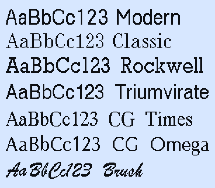
The CG fonts had only a subset of the characters from the built-in LOS fonts. To achieve parity, some work had to be done on my part to create glyphs for missing latin accented characters. I also added a Euro (€) symbol to the fonts, for all you Europeans out there (the Lisa was discontinued in 1985, and the Euro was created a decade later).
The help documents have been reformatted to use the new fonts. You should grab new copies from the "Help & Tips" disk via the option in the clock menu (the menu at the far right of the menu bar where the clock is normally located).
I really need to come up with a better name for this menu than "the clock menu". I'm not going to make this into an Apple menu... that feels too revisionist. LisaGUI is already more Mac-like in many respects than I'm comfortable with, but that would be crossing a line. Maybe I should call it the "Lisa" menu after the icon which appears when the clock is disabled. (Even that icon is modeled after the System 6 MultiFinder icon... I wasn't sure what else to put there!)
New Applications
There are two new apps to play with. The first is a simple app containing code I used to test out blending modes. It lets you place overlays onto the screen to see how the different blending modes interact with each other.
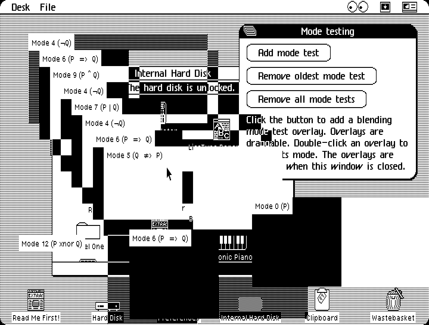
The second is a digital piano. It's similar to the piano from one of the Lisa Toolkit examples, and to the piano demo from the original Macintosh's "Mousing Around" demo from the 1984 "Guided Tour of Macintosh".
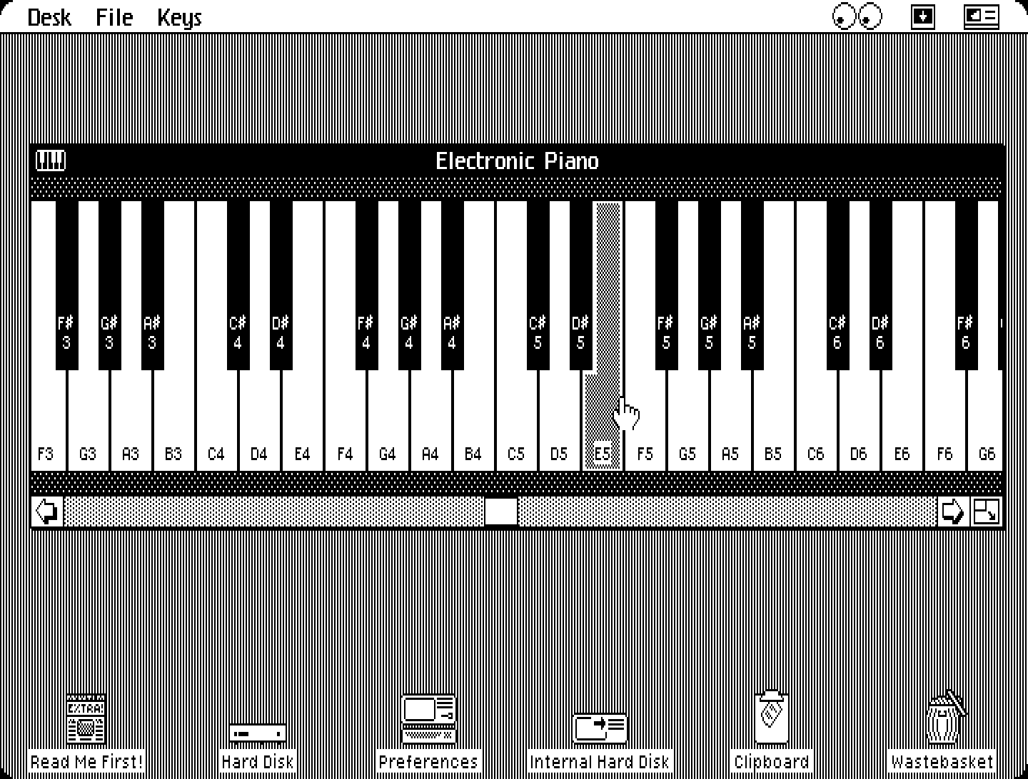
Both apps can be found in the "Spare desk accessories" disk, which can be inserted by clicking that option in the clock menu.
Desktop icon alignment
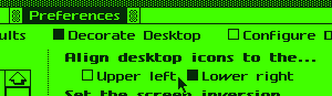
Whether or not desktop icons are aligned to the upper right or lower left is now dependent on a system setting found in the "Decorate Desktop" pane. The positioning scheme is now applied consistently when straightening up icons and setting aside files onto the desktop. Right now the default is lower left, which isn't ideal for LisaGUI given its adjustable screen resolution, but it just feels wrong and inauthentic to set the default to the upper right… I need a smarter solution, like an "auto-arrange icons after resize" option.
Other new features
- LisaGUI now has a new default color palette with higher contrast.
- The "Repair disk" option in the Desktop Manager's Housekeeping menu is now functional, as detailed in my previous post on LisaGUI's storage system.
- The artificial delays that appear during wait dialogs during file copying operations are now based, in many cases, on the amount of actual data being copied.
Less recent updates include nicer looking touchscreen cursor controls, and a rewritten compositing algorithm which uses bitwise operations to perform calculations per-word instead of per-pixel. It's an order of magnitude faster.