On Tahoe’s Use of Material, and What Should Have Been
WWDC is around the corner, and the rumor mill suggests we’ll see revisions to Apple’s Liquid Glass design language. The issues with Liquid Glass have been thoroughly discussed, so I won't go too in-depth on the subject. Last year I had hoped Apple would reintroduce skeuomorphism into the Mac’s UI. I guess you should be careful what you wish for... relying entirely on variations of a single material is a gigantic missed opportunity.
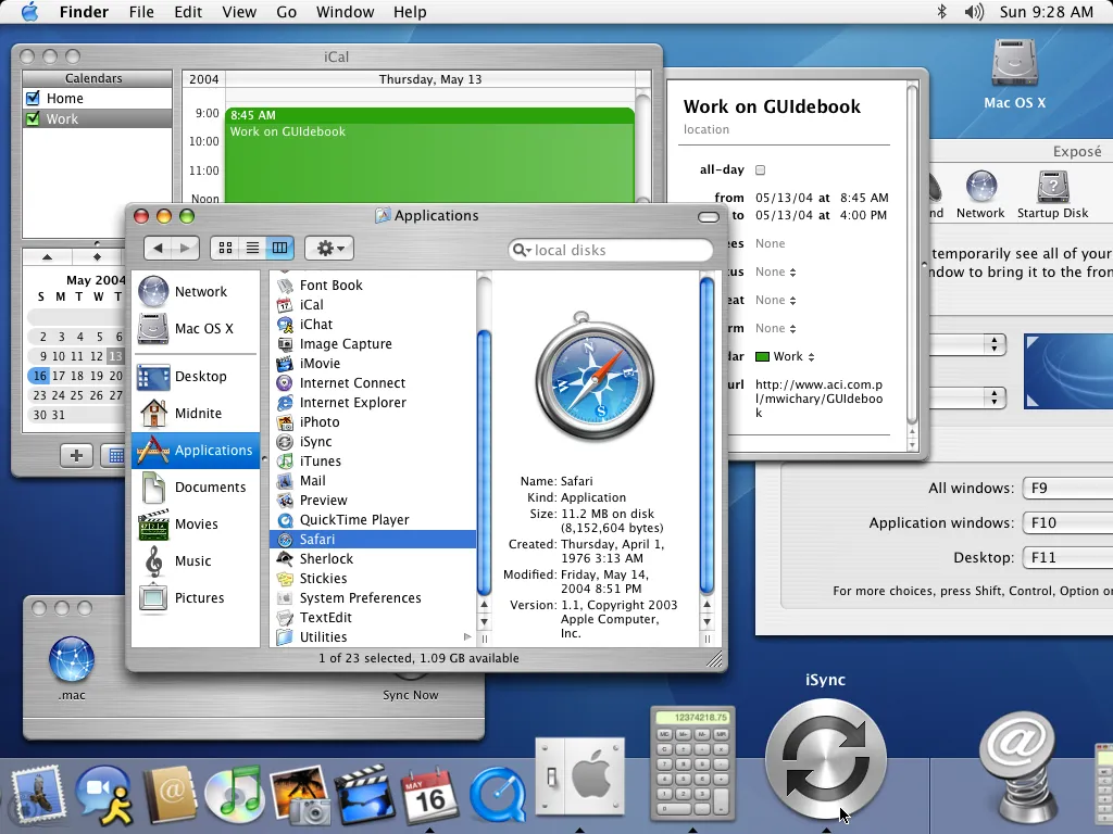
Back in 2000, Steve Jobs unveiled the initial incarnation of Mac OS X's UI. Although it was literally called “Aqua” its namesake material was used with a great deal of discipline, mostly limited to clickable objects like buttons, scrollbars, and column headers. Effectively, it served as a visual cue to indicate interactivity. As a result, Aqua elements took up relatively little screen real-estate. Part of what made Aqua so beautiful was how the smooth liquid elements contrasted with rougher materials in the UI. The two most prominent examples of this in early OS X releases were brushed aluminum, and a translucent pinstriped material reminiscent of the plastic from the original iMac’s iconic bezel.
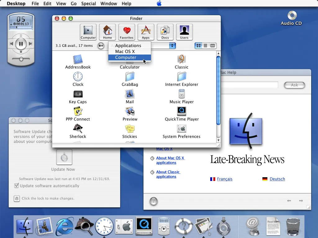
• These screenshots were taken from Marcin Wichary’s wonderful Guidebook Gallery because I was too lazy to make my own for this post
• Technically, the first Mac OS X UI was an iteration of the older Platinum UI from OS 9 as seen in the initial developer previews, but you know what I mean
I’m aware opinions on the look and feel of the initial OS X releases may be mixed when compared to Leopard and Snow Leopard. My point is: the liquid of Aqua was ever-present without being overwhelming. Its usage was balanced against a variety of other materials and textures, methodically sprinkled throughout the screen instead of slathered all over it, as is the case with Liquid Glass in Tahoe. I’m not against the use of dynamically refractive glass or translucent materials in a UI, but it needs to be used with care and moderation. Like any asset, overuse will result in devaluation.
Apple should have developed a dynamically lit, anodized aluminum texture to use in conjunction with Liquid Glass elements. This could be beautiful if thoughtfully implemented. Tahoe’s windows ought to be constructed from it - it’s the perfect choice. Such a material is opaque, subtly textured, and has its own separate set of optical properties which provide it with as much flexibility as glass, if not more.
The hue of the digital anodized aluminum can be changed to match the appearance of the actual hardware it's running on the same way Apple implements hardware-specific accent colors (although the usual neutral color with lighting attuned to the desktop background could work just as well). Its tone can be adjusted to differentiate between light and dark modes. And as anyone who has held a space-gray or space-black MacBook can attest to, a subtle change in the angle of lighting is more than enough to dramatically lighten or darken the material. This effect might be used, for instance, to differentiate between active and inactive windows.
On a side note, using changes in light to help communicate state would go a long way towards adding some real dynamism within the macOS UI. The thing about Liquid Glass right now is that it mostly sort of just sits there. It’s boring!
As an opaque material, aluminum will have less graphical overhead compared to glass. Also, given anodized aluminum has been Apple’s material of choice on so many hardware products over the past two decades, using it digitally builds on their legacy of tight hardware/software integration. Incidentally, there’s already a small precedent for its inclusion - it was seen in the dock in OS X Mountain Lion.
I’m not suggesting there’s no place for Liquid Glass - it’s actually better suited for use with interactive controls than the fixed bitmaps from the original Aqua UI. The dynamic refraction offers more opportunity for UI feedback; when clicked, Liquid Glass controls should deform as their state changes. The saturation, tint, and lighting of said controls should also be adjusted to indicate state, just as buttons in early OS X builds would slowly pulsate between blue and translucent tints as an indication they’d be pressed upon hitting the enter key.
The contrast between these two complementary materials strengthens them both. Building the entire UI out of one or the other will simply look stale - and that’s what we got with Tahoe. A stale UI, a UI with no personality or opinion, defined not by what it is but by what’s around it and behind it. It might as well not even be there. It’s the result of Apple trying to be all things to all people, rather than simply being itself.
Of course, there’s no reason to stop at aluminum. There’s an innumerable number of materials and textures one could consider. This is at least a start.